
SEKAI is a store we run inside the Second Life virtual world, where we sell HUDs and other virtual goods. This is the story of how the SEKAI Logo Design actually came together: the first badge we designed, why it looked the way it did, and how it got simplified into the mark you see across the site today.
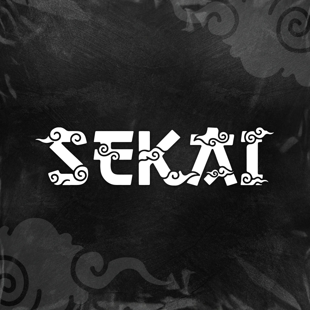
Quick answer: The SEKAI logo design started as a circular badge with a bold wordmark and two ornamental red cloud clusters, styled after traditional East Asian cloud motifs. It was later simplified into an open wordmark with the cloud shapes built directly into the letters themselves, dropping the badge outline and the second color so the mark could work across far more formats.
Jump to a section:
- The Meaning Behind the Name
- The Original Concept: A Badge With Two Clouds
- Simplifying the Mark: From Badge to Wordmark
- Old Logo vs. New Logo: What Changed and Why
- Why This Kind of Thinking Matters for Your Brand
- Frequently Asked Questions
The Meaning Behind the Name of the SEKAI Logo
Sekai (世界) is the Japanese word for world. Once that became the store’s name, the visual direction followed pretty naturally. We wanted a motif tied to something as big and borderless as the word itself, and clouds fit that better than almost anything else we sketched. In East Asian art, cloud patterns, often called kumo, have been used for centuries as an auspicious motif tied to the sky and to constant change, a tradition still visible in kimono and textile design today. That symbolism has carried through the logo since the very first sketch.
The Original Concept: A Badge With Two Clouds
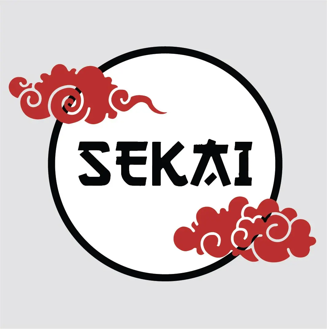
The first version of the logo was a circular badge. A bold, hand-inked SEKAI wordmark sat inside a black ring, with two red cloud clusters anchored in opposite corners, one upper left, one lower right, for balance. The red gave it energy against the black and white, and the circular shape made it work well as a profile picture or a stamp-like mark, closer to a seal than a wordmark. Here is what that first version looked like:
It did its job early on. A badge format is easy to recognize at a glance and reads well in a small square, which is exactly what a brand-new store needs on social media. But a circular badge is also a constrained shape. It does not stretch across a banner, it does not sit cleanly next to text in a header, and it is awkward to print small on physical merchandise like pins or embroidery. Once SEKAI’s items started showing up in more places, that badge started working against us instead of for us.
Simplifying the Mark: From Badge to Wordmark SEKAI Logo Design
The redesign was not about starting over. It was about figuring out what actually had to stay. The name stays. The cloud motif stays, because it is tied to the meaning of the store’s name. Everything else was up for removal.
The circle went first, opening the mark into a straightforward wordmark that scales cleanly from a favicon to a storefront sign. The second color went next. Dropping red in favor of pure black and white meant the logo could sit on almost any background without a palette clash, which matters once a mark starts appearing across client work, merchandise, and brand colors it does not control. The biggest change was where the clouds went. Instead of sitting outside the wordmark as separate ornaments, the cloud shapes were carved directly into the letterforms themselves, worked into the serifs and terminals of the S, E, K, and A. The symbolism did not get simpler. It got more integrated. You cannot have the wordmark without the clouds anymore, because they are built from the same lines.
Old Logo vs. New Logo: What Changed in SEKAI Logo Design and Why
Side by side, here is exactly what changed between the two versions and the reasoning behind each decision:
| Criteria | Original Badge Logo | Current Wordmark Logo |
|---|---|---|
| Format | Circular badge, seal style | Open wordmark, no container |
| Color palette | Black, white, and red | Black and white only |
| Cloud placement | Two separate ornaments outside the type | Built directly into the letterforms |
| Best use case | Profile pictures, small social avatars | Headers, banners, merchandise, signage, favicons |
| Scalability | Loses detail below a certain size | Reads clearly at almost any size |
| Overall feel | Traditional seal or stamp | Modern, integrated wordmark |
Why This Kind of Thinking Matters for Your Brand
the SEKAI logo is one of our own projects rather than a paid client brief, but it went through the same process every commissioned logo gets here. A first concept establishes the idea. Later revisions figure out what is essential and cut the rest, without losing the thing that made the concept work in the first place. That is a deliberate, iterative process a real designer runs, not something you get from a single AI-generated image with no version behind it to refine. To see how that same thinking plays out across client work, take a look at the custom logo design portfolio.
Paying commissions get the same care and are backed by a documented process, laid out in the Terms of Service & Design Policy. If you want a mark built with that same process, you can start a commission through the contact page.
Frequently Asked Questions
Why did the SEKAI Logo Design change from a red badge to a black and white wordmark?
The badge format worked well for a small social avatar but did not scale across banners, merchandise, or print. Moving to a single color, open wordmark made the logo usable in far more places without losing the cloud motif that gives it meaning.
What do the clouds in the SEKAI logo represent?
Sekai means world in Japanese, and the cloud motif is drawn from traditional East Asian cloud patterns often used as an auspicious symbol tied to the sky. It is a visual link between the store’s name and its meaning.
Is the old SEKAI logo still used anywhere?
No. The current wordmark has replaced it across the site and all active branding. The original badge is kept here as part of the design story.
Can SEKAI Designs redesign or simplify an existing logo like this one?
Yes. Logo simplification and rebrand work follow the same process shown here: understand what the original mark got right, then rebuild it to work across more places without losing that idea. Get in touch to start.
Does a logo redesign follow the same process as a brand-new logo?
Yes. Whether it is a brand-new mark or a simplification of an existing one, every project starts with a brief and a deposit, and includes a defined number of revision rounds before final files and full ownership are handed over.
A logo rarely arrives finished. It gets tested, it gets worn down by real use, and the parts that matter become obvious over time. That is what happened here, and it is the same process behind every mark in the portfolio. If you are working through the same kind of decision for your own brand, review SEKAI logo and brand identity design services, then get in touch to start from your brief.
Written by the team at SEKAI Designs, professional graphic design and 3D artistry with over a decade of combined industry experience. Learn more about the studio.